Tuesday, May 1, 2012

TYPE BOOK update

Here are some images from my type book sample,..... so far

I decided to use a section of the story of "Alice in wonderland" as source material..... specificly, the part where Alice follows the rabbit down the hole.

The book's design will get more and more chaotic as you read along- like falling down a dark hole.


One of the primary "tricks" used in making these images was to apply the "Radial Blur" effect to letterforms. By using patterned fills, then spinning them with the effect, I got some pleasing effects. I also copied and pasted several layers of the same, blurred type to "pile up" the effects.

Another "trick" was to take a screen shot of a part of my design and "place" it into Illustrator. I then assembled, stretched and organized them into a new image. I thought it made some wonderful visual "textures".

The keyboard command for a screenshot is: hold the "command" key and the shift key, then hit the "4" key. You can select what part of the screen to capture. The image is saved to the desktop.

Here's a sample of the screen shots:


Thursday, April 26, 2012

Typography Research

Here are some sites to visit for inspiration about typography design and books

AIGA DESIGN ARCHIVES @ http://designarchives.aiga.org/#/home

COMMUNICATION ARTS @ http://www.commarts.com/exhibit

RISD Graphic Design Department Gallery @ http://gd.risd.edu/www/gallery/

A BLOG of type Designs @http://inspirationfeed.com/inspiration/typography-inspiration/60-remarkable-examples-of-typography-design-6/

DESIGN.MAG site for links @ http://designm.ag/inspiration/typography/

DAVID CARSON!!! (Off the Grid typography) @ http://www.davidcarsondesign.com/

The Story Of....

Apply your knowledge of typography and the type tools in Illustrator to the creation of a book that tells the "story of...."

The book will use type to describe the story or message in WRITTEN WORDS, but also with VISUAL EFFECTS and ORGANIZED DESIGN.

Here's the requirements:

FORMAT
 You are creating a four page book, with 8 pages to design.
Page sizes are 5.5 X 8.5 inches (fold a letter size print in half)

DESIGN
Organize the information in the book using a visual "grid" and guides....
Feel free to manipulate the grid structure, even "break off it" to get visual drama.
Each page should have a VISUAL HIERARCHY to lead your viewer through the information.

CREATIVITY
Use type to convey the message visually as well as in readable words..
RESEARCH how other designers use type effectively...

SKILLS

Demonstrate your knowledge of these type skills and controls in your work.
font (serif vs sanserif fonts)
Size
Leading- space between lines of text
Kerning- space between letters and or words
Collumns- to organize words
"Text wrap"
indent controls
 allignmnet


Here is a sample of my layout in illustrator


Tuesday, April 24, 2012

Layout Skills With Illustrator

Let's get these basic designer skills under control- 

We are going to create a "test" layout using the tools in Illustrator, then recreate a magazine layout.


Here are the main tools to use:

Character controls


Paragraph controls


Type tools


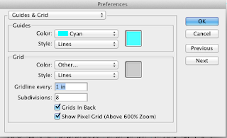
We will also rely on the RULERS, GRID and GUIDES for measuring and organizing images on the page.

Notice the Grid settings controls...


Monday, April 23, 2012

Animation Posting

Post answers to these questions about your final animation...

1. Theme- What is the "big idea" behind your movie? How did you convey that idea? Did you use color, subject matter, point of view, "camera focus", or other visual effects?

2. Which animation technique, or effect (fades, movement through frame, or panning) worked best in your movie?

3. What discovery did you make while creating the movie?

Friday, April 13, 2012

Blur With Panning Trick

I wanted to recreate the effect of a camera "focusing in" on a mug on the window. So, I created a series of steps to make the animation....

Here's the steps:

1. Create two copies of the scene, and use gaussian blur filter to blur one....


2. Create a layer mask on the blurred layer, i used a circular gradient to get a "bullseye" effect.

3. unlink the mask from the blurred image.


4. Transform the mask to enlarge it to three times the size of the image.

5. Create new frames as you "pan" the mask through the scene.... the mask reveals the crisp image as you pan....!!!!!

6. I used "tweening" to create most of the movie- it worked!!


Heres the movie so far!


Link To Some Great Videos

Check these out for ideas about blur, panning, movement through frame and creating emotion with images.

http://www.shortoftheweek.com/2010/12/26/top-10-short-films-of-2010/


Check This Video Out!!!

Check out this quick tutorial video about the animation tools in photoshop..... some new ideas explained include:
make frames from layers
modifying all frames automatically
reversing the order of frames
and the timing of frames

Good info for you!!

See the video here @ http://www.adobe.com/designcenter-archive/video_workshop/?id=vid0023

Thursday, April 12, 2012

Changing Focus animation experiment

Here's a test I tried for the "camera focus" effect....
I used the "Blur" filters in photoshop, with a change in the size of the man to make him appear out of the background....


It's rough now, and I'll work to get it clearer...

Here's the layers used, see the copies of the guy set to different levels of blur?


Here's the animation frames.... I used the "tweening" to make 5 frames in between the blur stages of the guy....


Here's the movie


Wednesday, April 11, 2012

"Panning" in Animation

Here's an example of "panning", or creating the sense of moving the "camera", or moving a foreground element. 

I thought to create the illusion of subway car windows rushing by- what you might see riding the trains in Boston...etc.

I build the pieces of the scene, using one image of a subway car interior and adding the image of Lincoln. I used Photoshop's "adjustment layer" feature to "colorize" Lincoln to match the colors in the subway car interior. Now he seems to be INSIDE the car....


Next, I created the windows to rush by in the foreground. Because I needed a LONG strip of them to drag through the scene, I created a separate photoshop canvas almost three times the length of the original canvas, 18 X 6 inches compared to the original 8X6 inches.

Then I could draw the silhouette of the windows using selections and fills....


I then dragged the windows into the Lincoln workspace, and began to create animation frames.... I moved the windows with the keyboard arrows as I made frames. Moving it more and more each frame created the illusion they were "speeding up" (the train was accelerating). Holding the "shift" key  while pressing the  arrow key made the windows move further each time.

The final movie has over 40 frames.......


Here's the movie so far.... I'll begin to add other effects next...