Thursday, December 15, 2011

Modern Surrealism with Photoshop

Here are several examples of Surreal artwork created with photoshop..... The main skills used in creating the images includes:
Using layer masks, 
Adjusting color and value,
changing opacity and blur

"Assembler", by Kosmur

"Delirium", by Valkiria

"Human", by Dreamspeak

"Melusine", by Wishmistress

"Escapar", by Prince K.

Wednesday, December 14, 2011

I'M OUT TODAY (wednesday)

Hey guys,
Sorry I'm out today.... I'll be back Thursday

Meanwhile, I've put TWO new posts on this blog for you-

One about the Surrealist artists..... check check out the links to see more of their work (especially Dali)

Another about selecting in Photoshop-hope it helps you increating your new images today...

Just mess about with photoshop and selections today- practice using masks, brushes and the selection tools.... those are important skills!

See you thursday!
Powers

SURREALISM, whats old is new again...

Here are some examples of Surrealist art- both old and new versions. This art style, started as a reaction to the ideals and politics that started World War 1, uses images from the artist's dreams or subconscious ideas. Artists involved incuded: Dali, Giorgio de Chirco and Magritte.

See more about the movement and the artists here @http://www.ibiblio.org/wm/paint/glo/surrealism/

and more on Dali here@ http://www.virtualdali.com/index.html

the surrealists together (Dali is second from left in front)

by Magritte

that's dali!
By DeChirco


PHOTOSHOP Selecting Tips....

Here's more about that "Quick Selection" tool......


• this tool looks for "edges" made from changes in value or color...
• you click and drag over the area you want to select.... pushing out the selection shape,
"marching ants" show the selection area


Shrink the selection by holding the "option" key and push from outside the selection.

Always turn on the "auto-enhance" and "sample all layers" buttons!!!

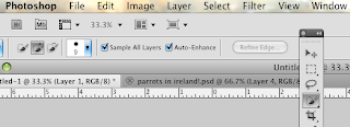
See the "refine edge" button on grey?


After getting the basic selection,  click the "refine Edge" button...
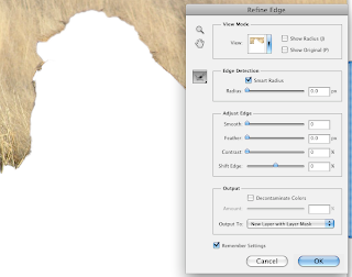
The "edge definition" slider makes the most changes...

Use the "Edge Definition" slider to change how the tool sees and fixes details

Then paint the brush over the image where you want to "clean up" a selection...


Don't forget to "Output to layer with a layer mask"

That gives you a new mask to play with...

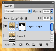
The mask is the black and white shape...

To fix other details, paint on the mask with brushes to hide or reveal details...

Hold the "option" key and click on the mask to see it like this..... click back on the layer thumbnail picture to see the regular image again...
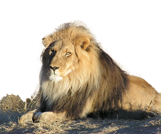
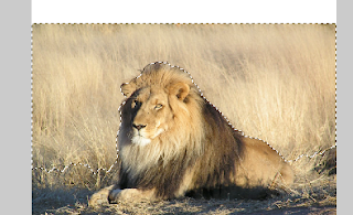
Look how the edges of the Lion work with the edges of the mask...

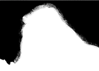
See how the edge changes from smooth to blurry to jagged?


Monday, December 12, 2011

Morgans bag


My bag matches my logo because i used the rope in the logo as the rope a man is walking on.  The rope is breaking because tenuous means very weak and slight.  You don't see the rope breaking at first which also goes with the definition.   (p.s. my pictures aren't very good because my bag is behind glass.)

Thursday, December 8, 2011

August's bag


My bag relates to my logo because of the contents. On my bag, there is an explosion of food, with the logo in the center of it. This explosion helps to convey the idea that the grape is the most important thing on the bag (because it is in the center, almost untouched by the explosion). I used food in the explosion because "epicurean" pertains to food. I also used a cartoon-like feel throughout the bag to keep the feeling between the bag and the logo, the same.

Tuesday, December 6, 2011

franks bag


this bag relates to the word dilatory because there is a long path showing that it would take a long time to make it to the end ( being slow or tardy ).  also there are snails though out the bag, snails relate to the word because they are slow.

Monday, December 5, 2011

Allison's evanescent bag!


 EVANESCENT


This bag relates to my word of evanescent (soon passing out of sight, memory or existence) because the red gradient implies that the bag is dissolving. The gradual size and color difference in the hearts also implies that eventually they will be out of sight.


Hannah's Bag


My bag relates to my logo tumultuous, meaning something loud and annoying, because image of my sister is someone covering her ears showing that the logo is making loud and annoying sounds. Also the words in the speech bubbles illustrate the same type of word except it has the synonyms. 

Friday, December 2, 2011

Jen's Bag


My bag relates to my logo for unfettered, meaning: release from restraint or inhibition, because of the repeated images of the butterflies. There is a statement of the definition on the bag. The butterflies are released from the inhibition of cocoons and are now flying freely.

Madyson's bag


My bag decoration matches my logo because I used the Heaven and Hell scene and the shadow of death to play up the ultimate meaning of my logo. When you look at my bag, you see the decision scene between going to Heaven or going to Hell after death.

kelsey's bag-nefarious

nefarious


the bag design matches the word nefarious because the lines leading to the logo are jagged and intimidating. they're all over the place and have a wicked vibe to them. 

Kat's Logo: Buoyant

My word was buoyant, meaning having tendency to float or have a cheery nature.

The logo demonstrates the word with the use of the orb hovering over a vortex. The lines could be indicative of a person raising their arms in joy, with a buoyant mood.

Kat's Logo Bag


The design on my bag relates to my logo for buoyant, meaning to float of be of cheery emotional state. I related the sailboat floating in the ocean, because it is literally buoyant as it sails through the water.

Tuesday, November 29, 2011

Sam's Bag


The design relates to the logo and, ultimately, the word "inferno." The swirling hands drag the eye down into a firey, burning hole (hell).   

Allison's Logo!

1. My word was evanescent and it means to soon pass out of sight, memory or existence.

2. To express the meaning of evanescent, my logo contains hearts with a dotted pattern fill, along with a drop shadow. The hearts gradually get small, from left to right, and as the hearts get smaller, the dots in the pattern fill also get smaller and less dots appear. The drop shadow below each heart also become less opaque with each heart.

Sol Lewitt Project

We are going to create a wall sized drawing made up of tiles..... You design a series of tiles based on the requirement list below..... then we will install them onto a numbered "grid".

Create an 8 by 8 inch area in Illustrator

Step 1. Fill the space with "harmonious lines", lines that are parallel or visually "fit" together... print it

Step 2. select a square PORTION of that drawing and enlarge the contents to 8X8 inches.... print it

Step 3. Tape up one of your drawings to the wall, outside our room.

Here are some examples of what the lines might look like:


Durer's sketch uses harmonious lines to describe form..


Now for the idea behind the project....

Here are a series of SOl Lewitt pieces. His work is based on an "Idea" or directions given to the gallery- then the artwork is recreated by others, following Lewitt's directions.