Here's a link to the handouts for the Self Promo Project....
Here @http://wawacdesign.blogspot.com/2012/01/about-that-final-project.html
Monday, December 17, 2012
Monday, December 10, 2012
A New Design Challenge
Here's the info for our new design job..... yes, it's from Kenzie!
hi Mr. Powers,
for the water bottle posters there are only a few
requirements and the rest can whatever the designer want to put on it as
long as it relates to the idea, the poster needs to read the following:
End Bottled Water at Woodstock Academy/ WA (either one works)
Sign the petition on
Monday December 17, 2012 at all lunches
also the poster needs to include some kind of fact about water which they can choose from the following:
780 million people lack access to clean water
bottle water cost $.05 an ounce, public water costs less than 1 cent per gallon
bottle water produces up to 1.5 million tons of plastic waste
plastic for bottle water requires up to 47 million gallons of oil per year
bottle water means less attention to public systems
fresh water, due to privitization, is becoming a precious commodity
Thank you very much Mr. Powers for letting us do this project your class,
Kenzie Papuga
Tuesday, November 27, 2012
Monday, November 26, 2012
READ IT AND WEAP!!!
Information for the
program cover-
Woodstock Academy
Music Department Presents a
Winter Concert
Saturday, Dec. 15,
2012
3:00PM
Amy Ranta, Choral
Conductor
Lauren Churchill,
Instrumental Conductor
Brenda Rich-Pike,
Accompanist
Hyde Cultural Center
Wednesday, November 21, 2012
Creating With Photoshop!
Check out Oleg's work...... especially the video of him working. Notice how he explores the use of visual TEXTURES and changing VALUE and COLOR in his images.
Interesting creative use of Photoshop, eh?
See more here @ http://olegdou.com/

This video is here @ http://www.adobe.com/products/photoshop.html

Interesting creative use of Photoshop, eh?
See more here @ http://olegdou.com/

This video is here @ http://www.adobe.com/products/photoshop.html

Tuesday, November 20, 2012


Gradient Tool Effects!
The gradient tool is great for lighting effects.... like light beams.....

Here's one way to make them...
First, the tool and it's control panel....


Make a selection in the shape you want the beam.....
Fill the selection with a gradient (gradient is solid color to transparent!)
Change the LAYER MODE for the beam to OVERLAY, or SCREEN to make it glow!

Which beam is the fake?

Monday, November 19, 2012
New Tools To Learn....
Clone Stamp Tool- Lets you "target" an area of pixels and "stamp" them onto the layer. Useful if you want to connect two images edges that just don't match up.....
• Hold the "option key" to target
• Use a blurry brush shape
• Use a low "flow" rate
• Avoid any noticeable patterns, by constantly targeting new pixels

Use this image to practice....

Do this too it!!!

• Hold the "option key" to target
• Use a blurry brush shape
• Use a low "flow" rate
• Avoid any noticeable patterns, by constantly targeting new pixels

Use this image to practice....

Do this too it!!!

Thursday, November 15, 2012


Learning Photoshop- Part 1
Here is a copy of the Outline for learning Photoshop

And here are some of the tools we will be using the most!!!


And here are some of the tools we will be using the most!!!
Layers pallet

Selection tools

Controls for refining a selection

Adjustment Layer controls

Thursday, November 8, 2012
Posting The Bag....
Post three photos of your completed bag (built), and post the flat color bag pattern to your blog. Answer these questions about your ideas and work....
• How did you use color, value, shapes, symbols, visual textures, or other visual effects to make the bag respond to the logo's meaning?
• What are the visual surprises in the bag to keep the viewer looking at it?
• What was your best discovery in creating the bag project?
• How did you use color, value, shapes, symbols, visual textures, or other visual effects to make the bag respond to the logo's meaning?
• What are the visual surprises in the bag to keep the viewer looking at it?
• What was your best discovery in creating the bag project?
Sunday, October 14, 2012
For Monday, October 15th! I'm out of school!!
Hello guys,
Sorry to be out..... I may be out this whole block too (ug).
We will start designing your own logos Tuesday, when I get back.... Until then you have several things to complete:
• Print your full size Type poster..... 13 X19
• Gather the logo samples
• Recreate 4 of the logos with illustrator.
If you've done all that, try this idea......

Here are some samples of these "town logos" they use "kanji" characters in their design.... It's interesting that they are Chinese characters used in Japanese writing...
read up on it.... @ http://en.wikipedia.org/wiki/Kanji
Here are links to see more of the logos listed here-


Thursday, October 11, 2012
Work for Thursday, October 11th.
Sorry that I'm missing class today- here is an interesting project for you....
We are going to explore LOGO DESIGN, so you need some background info on what a logo is...
Follow these directions to gather examples of good logo designs to inspire you when creating your own logo.

Here are those sites as links.....
http://goodlogo.com
http://studio.adobe.com/explore/gallery/tolleson/main.html
http://www.howdesign.com/design-creativity/top-10-sites-for-designers/top-10-websites-for-designers-october-2012/
http://www.commarts.com/CA/exhibit/
http://designarchives.aiga.org/#/entries/%2Bcollections%3A%22AIGA%20365%3A%20Design%20Effectiveness%20%282011%29%22/_/grid/relevance/asc/0/48/90
Here's an example of what the gather logos would look like on the page....

We are going to explore LOGO DESIGN, so you need some background info on what a logo is...
Follow these directions to gather examples of good logo designs to inspire you when creating your own logo.
Here are those sites as links.....
http://goodlogo.com
http://studio.adobe.com/explore/gallery/tolleson/main.html
http://www.howdesign.com/design-creativity/top-10-sites-for-designers/top-10-websites-for-designers-october-2012/
http://www.commarts.com/CA/exhibit/
http://designarchives.aiga.org/#/entries/%2Bcollections%3A%22AIGA%20365%3A%20Design%20Effectiveness%20%282011%29%22/_/grid/relevance/asc/0/48/90
Here's an example of what the gather logos would look like on the page....
Thursday, October 4, 2012
Color Halftone Effect!!!
One of my favorite effects! Here's how you do it....
In Illustrator, select a picture or shape..... the shape needs to have a colored fill (black and white won't work well)

Choose the command off the main menu...

Play with the settings for SIZE and angles of the "channels"..... the four channels relate to colors..... the bottom one is "Black"...

Try setting all but one angle to "0" to get a monochrome effect...
Here's one example of what happened to my image.... cooooooool!

Some other examples.....


Friday, September 28, 2012
TYPE POSTER IDEAS...
Here are some exciting uses of type in posters.... Look how they use the Positive and negative space, how they overlap objects, how they make visual texture....
See more here @ http://www.webdesignerdepot.com/2009/09/30-typography-posters-that-youve-probably-never-seen-before/


Here are some more experimental type designs from this site @ http://www.webdesignerdepot.com/2011/05/mind-blowing-examples-of-experimental-typography/


See more here @ http://www.webdesignerdepot.com/2009/09/30-typography-posters-that-youve-probably-never-seen-before/


Here are some more experimental type designs from this site @ http://www.webdesignerdepot.com/2011/05/mind-blowing-examples-of-experimental-typography/


Wednesday, September 26, 2012
Posting Your Work....
When posting your design work to the blog, briefly answer these questions about the work.....
5 Squares designs- for each design, explain what the squares are doing, and how you used visual clues to help us understand it.....
Mention any of these topics in your answer-
5 Squares designs- for each design, explain what the squares are doing, and how you used visual clues to help us understand it.....
Mention any of these topics in your answer-
• the squares location in the design space
• their orientation (diagonal, horizontal, etc.)
• how close together they are
Book designs- Describe what the focal point of each design was, and describe what is the best part of your design....
Tuesday, September 25, 2012
Typography Studies Checklist...
Here is a checklist of ways to modify letters to make them LOOK like what they MEAN...


Wednesday, September 19, 2012
Start your Blog!
Follow this link to directions for creating your blog!
Remember the blog is for CLASS USE ONLY.....
Got to this link @ http://wawacdesign.blogspot.com/2012/03/lets-blog.html
Remember the blog is for CLASS USE ONLY.....
Got to this link @ http://wawacdesign.blogspot.com/2012/03/lets-blog.html
Thursday, September 6, 2012
Good Design Checklist!
Use this as a guide in creating your pages to the "four designs book"...

The Book includes these designs, one per page:
Page 1 is LINES only.... use the "stroke" settings in Illustrator
Page 2 is SHAPES and VALUES only, use the "fill" settings
Page 3 is pattern fills, use the swatches controls to make your own!!
Page 4 uses Letters and numbers, use "create outlines" to turn them into shapes....
Thursday, August 30, 2012
Some Design Inspiration!!!
Here are some designer's websites and examples of their work to get you goin'
JOSHUA DAVIS is a web designer, who uses Illustrator to create shapes from observation. He wrote code that plots out patterns using his shapes- he then chooses results he likes and develops them into his art.
Very smart, creative guy.
See more here @ http://www.joshuadavis.com/
Samples of his work....


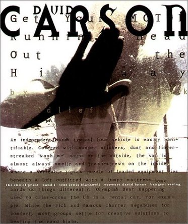
David Carson, best known for revolutionizing graphic design and the use of TYPE in design. Look how he works the negative space!!!
See more of his work here @ http://www.davidcarsondesign.com/


JOSHUA DAVIS is a web designer, who uses Illustrator to create shapes from observation. He wrote code that plots out patterns using his shapes- he then chooses results he likes and develops them into his art.
Very smart, creative guy.
See more here @ http://www.joshuadavis.com/
Samples of his work....


David Carson, best known for revolutionizing graphic design and the use of TYPE in design. Look how he works the negative space!!!
See more of his work here @ http://www.davidcarsondesign.com/


Subscribe to:
Posts (Atom)