
Thursday, May 31, 2012
ROZ'S Design Final
Roz made this poster using Illustrator.... it was printed at 30+ inches long and displayed in the hallways....
Look at her great use of TEXT and how she incorporated it into the image.....

Look at her great use of TEXT and how she incorporated it into the image.....

Max Mercier's "Change The World" Series
Max created a series of posters to change behavior at the Academy. Look how he used TYPE, COLOR, VISUAL TEXTURE and other elements and principals in these images...
These were printed 20X30 inches for maximum visual impact.


These were printed 20X30 inches for maximum visual impact.


Tuesday, May 29, 2012
Final Project 2012
Change The Academy! Use the power of design to change the behavior of students and others at the Academy- FOR THE BETTER!
Here's the handouts.....


Here's the handouts.....


Final Project Idea Sources....
Here are some sites devoted to selling posters and sending the proceeds to relief funds.
The first is "THE HAITI POSTER PROJECT"
See more here @ http://thehaitiposterproject.com/posters/view/artist:412

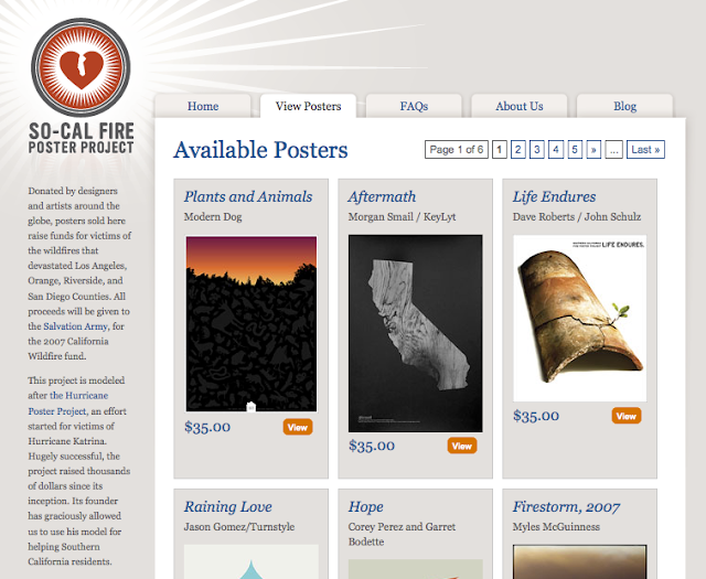
Another good one is the "So-Cal Wildfire Poster Project"
See more here @ http://socal.reliefposters.com/rp/
The first is "THE HAITI POSTER PROJECT"
See more here @ http://thehaitiposterproject.com/posters/view/artist:412

Another good one is the "So-Cal Wildfire Poster Project"
See more here @ http://socal.reliefposters.com/rp/

Thursday, May 24, 2012
DESIGN ENVY
Yet ANOTHER great place for ideas,
check this link for good examples.... but
also go to the "curator's" links to see THEIR work too!!!
See more here @ http://designenvy.aiga.org/curators/
Wonderful ideas!

check this link for good examples.... but
also go to the "curator's" links to see THEIR work too!!!
See more here @ http://designenvy.aiga.org/curators/
Wonderful ideas!

Wednesday, May 23, 2012
Interesting Technique for "Weathering"
Check out this tutorial for weathering an image, or text.... cool possibilities.
The artist makes good use of several layers of hand painted forms, then works the LAYER MODES, like 'Darken" and "Color Burn"...
Find it here @ http://www.3dtotal.com/index_tutorial_detailed.php?id=657#.T70I9L_bgy6

The artist makes good use of several layers of hand painted forms, then works the LAYER MODES, like 'Darken" and "Color Burn"...
Find it here @ http://www.3dtotal.com/index_tutorial_detailed.php?id=657#.T70I9L_bgy6

DESIGN THE CALENDAR!
THE IDEA
We have been asked to design the cover for the Academy Student Handbook and Calendar for the 2012-13 year....
Here is the current design....


Essential Questions
• Write answers to these questions on your blog along with images that explain your creative process.
What are you saying about the Academy with your design?
Which element of design is most important in your piece...?
What is the FOCAL POINT of your design? How have you lead the viewer into and through the piece?
Design Requirements
*The
design must promote the positive attributes of the Academy- look a the
academy's web site to research what the school "stands" for, their
motto's etc.
Check this link @ http://woodstockacademy.org/index.php/history-of-wa/history-of-woodstock-academy.html
Check this link @ http://woodstockacademy.org/index.php/history-of-wa/history-of-woodstock-academy.html
• Create a brainstorming sheet to develop your ideas around a theme.
• The design must have this information (easily read) on the cover:
Woodstock Academy
Student Handbook and Calendar
2012-2013
Layout Requirements
• Photoshop- 300 dpi resolution, greyscale image mode, letter sized canvas

• Illustrator - letter sized artboard, Landscape, No color used in the design..

Monday, May 21, 2012
MORE DESIGNER BRAIN FOOD
Here's more good stuff to look at and work off of... These samples had wonderful use of COLOR and VISUAL TEXTURE.
I encourage you to layer and crop images to build up interest.
See more here @ http://sixwordstoryeveryday.com/Best-of-2011


I encourage you to layer and crop images to build up interest.
See more here @ http://sixwordstoryeveryday.com/Best-of-2011


Sunday, May 20, 2012
JEFF ROGERS, Designer
Check out his wonderful designs for posters and especially TYPE!
See more here @ http://howdyjeff.com/#/Gallery/Posters/image_46484


See more here @ http://howdyjeff.com/#/Gallery/Posters/image_46484


Subscribe to:
Posts (Atom)